Designing a Beauty Brand in Motion: From Visual Identity to Mobile Experience
Aligning brand, narrative and environment to support a scalable, experience-led business vision
Role
Brand & Experience Strategist leading identity development, marketing collateral and spatial concept design
Focus Areas
Brand Identity Development
Experience Design & Spatial Concepting
Visual Systems & Narrative Alignment
Marketing & Client Acquisition Assets
Deliverables
Brand Identity
Marketing Collateral
Brand Moodboard & Visual Direction
Website Design
Conceptual Spatial Design
Context
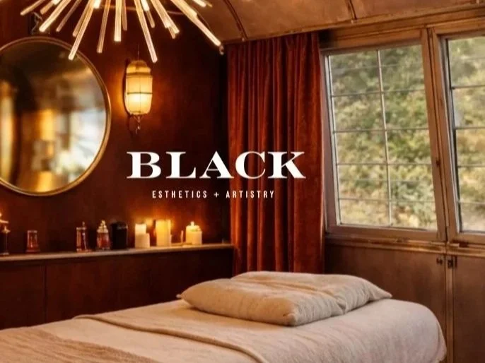
This project began with the development of a personal brand identity for an independent makeup artist transitioning from service-based work into a more defined and scalable business model. While the immediate need was a cohesive visual identity and marketing presence, the long-term vision extended beyond traditional service environments — toward a mobile, experience-driven concept housed within a converted Airstream trailer.
Audience & Positioning Insight
The audience included clients seeking elevated, personalized beauty services with a focus on experience, convenience, and aesthetic cohesion. The challenge was to create a brand that felt both intimate and distinctive, while also being flexible enough to expand into a future physical environment. This required building an identity that could operate across current touchpoints while anticipating a more immersive, spatial expression.
Strategic Problem
Creating a cohesive brand identity that supports immediate business needs while anticipating future expansion into a physical, experience-based environment.
Strategic Intervention
Developed an integrated identity system and extended it into both marketing touchpoints and a conceptual spatial environment—ensuring continuity across brand, service and future experience.
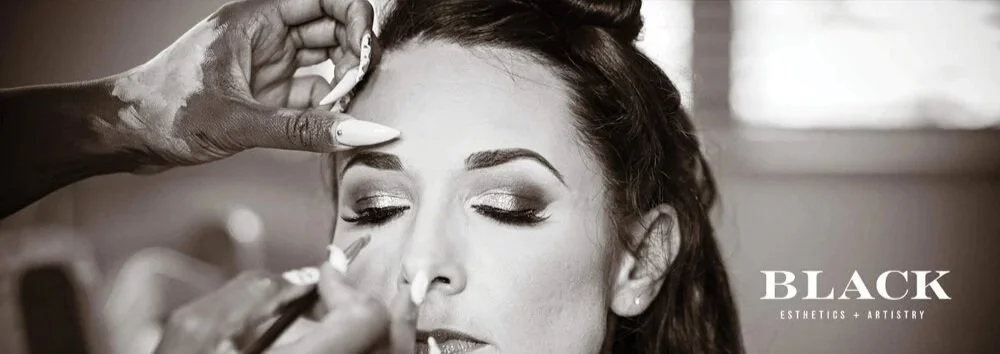
Beginning with foundational brand identity, including typography, color and a custom illustrative bee motif that served as both a visual anchor and symbolic element of the brand’s personality, I approached the work as a system. From there, I extended the identity into marketing collateral, including a website, print materials, and event-facing assets designed to support visibility and client acquisition.
In parallel, I developed a conceptual spatial identity for the mobile beauty bus — translating the brand into a physical environment before its realization. This included envisioning how the identity would manifest through materials, layout, and customer experience within the Airstream format, ensuring continuity between brand, service, and space.
System Built
A flexible brand system designed to operate across digital, print, and physical environments — including a forward-looking spatial concept aligned with the brand’s long-term vision.
Key components included:
brand identity and logo system
typography and color architecture
visual storytelling direction
digital and print marketing collateral
foundational brand guidelines for future expansion
Together, these elements created a repeatable design language that allowed the brand to maintain consistency while adapting across evolving content and services.
Outcome
The result is a cohesive, scalable brand foundation that strengthens client perception, supports current business growth, and provides a clear roadmap for future experiential expansion. By aligning brand, marketing and spatial concept from the outset, the work establishes a clear and scalable foundation — enabling the brand to evolve seamlessly from independent service to immersive experience.
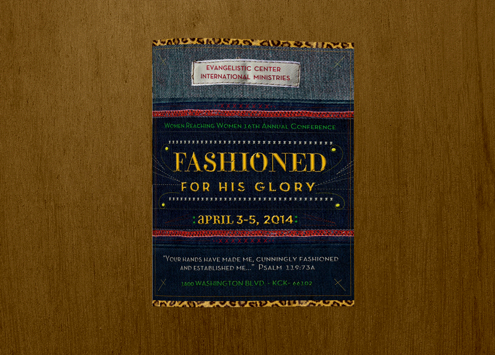
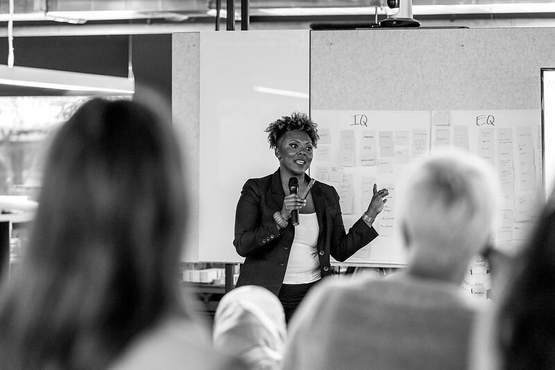
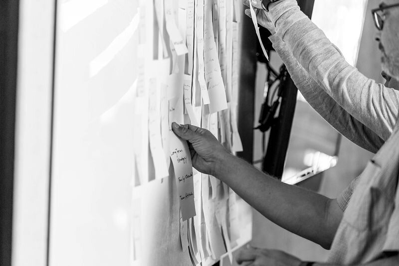
Designing Continuity: Evolving a Women’s Conference into a Cohesive Experience System
Cohesive, recognizable event experience driving sustained engagement and long-term client partnership
Role
Brand & Experience Strategist leading multi-year identity and experiential design
Focus Areas
Brand Systems
Experiential Design
Campaign Alignment
Audience Engagement
Deliverables
Event Identity System
Marketing Collateral
Environmental Graphics
Digital & Print Promotions
Context
6-year partnership supporting a recurring women’s conference.
Over a six-year engagement, I partnered with a recurring women’s conference to evolve its brand from a series of annual themes into a cohesive, experience-driven system. My role extended beyond visual identity into shaping how the event was perceived, navigated, and remembered — ensuring each year felt distinct, while still reinforcing a recognizable and trusted core identity.
Audience & Positioning Insight
Women seeking connection, empowerment, and personal growth.
The conference served a diverse audience of women seeking connection, empowerment, and personal growth. As the event expanded, the challenge became less about creating compelling visuals and more about maintaining continuity across touchpoints — from pre-event marketing to on-site experience — while allowing each year’s message to resonate with clarity and emotional relevance.
Strategic Problem
Maintaining brand continuity while evolving annual themes and scaling audience engagement.
I approached this as a systems problem: how to build a flexible identity framework that could evolve annually without fragmenting the brand. This required aligning messaging, visual language, and environmental graphics into a unified experience that supported both audience engagement and organizational growth.
Strategic Intervention
Developed a flexible identity system aligning messaging, visuals, and experience across all touchpoints.
Across each iteration, I developed integrated branding and marketing collateral spanning digital promotion, print materials, and on-site experiential design. More importantly, I established a repeatable structure — one that allowed the brand to adapt to new themes while maintaining coherence across campaigns, environments, and audience touchpoints.
System Built
Repeatable, scalable brand framework adaptable year-over-year.
The result was a conference experience that felt intentional and immersive year over year — strengthening audience recognition, deepening emotional connection, and supporting sustained attendance and engagement. The longevity of the partnership reflects not only consistency in execution, but trust in a strategic approach that prioritized clarity, cohesion, and evolution over time.
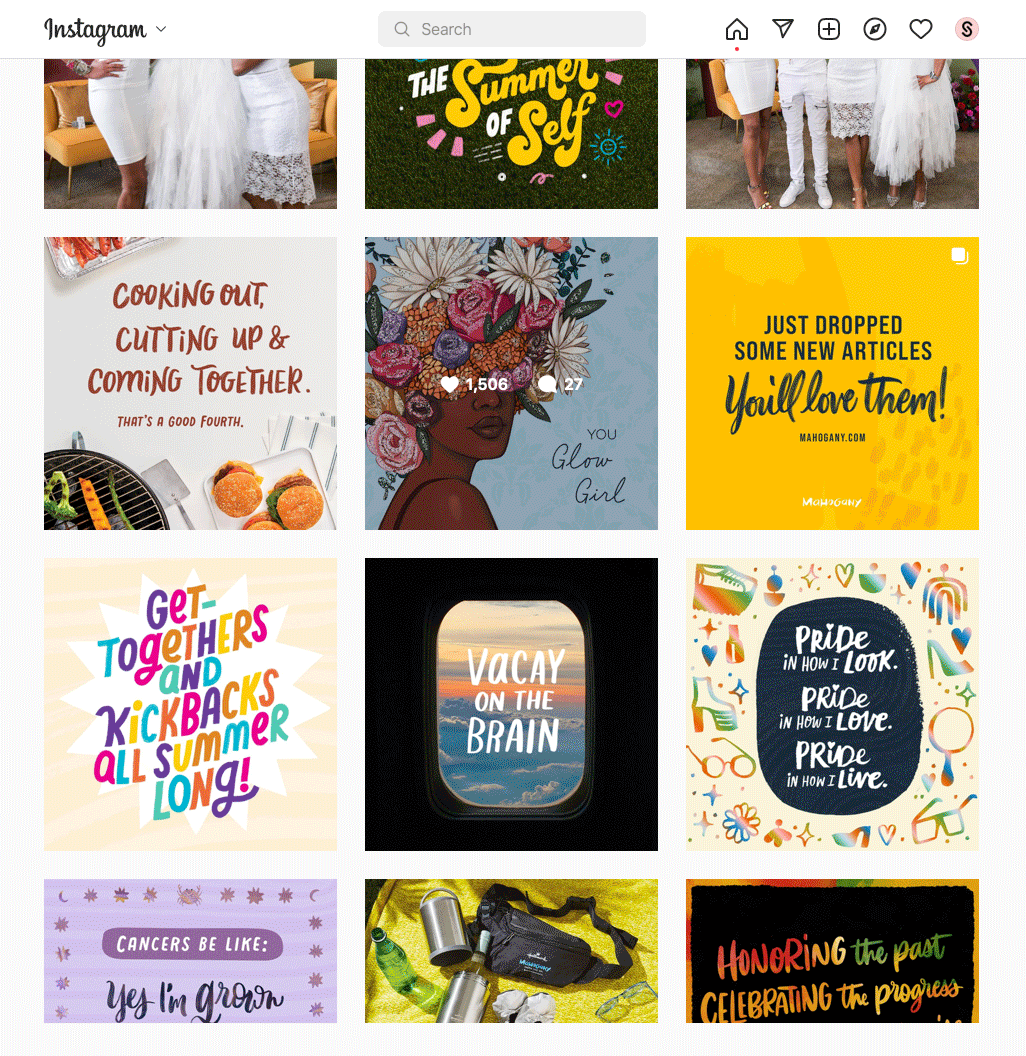
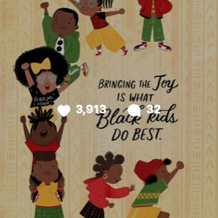
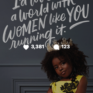
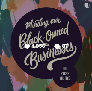
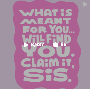
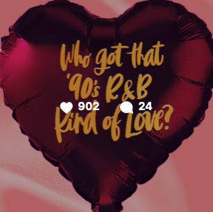
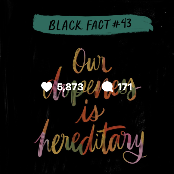
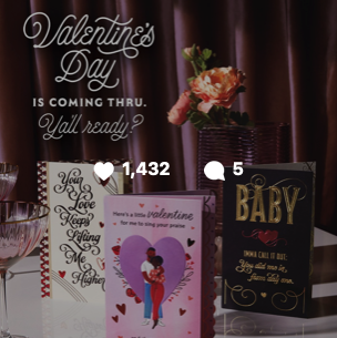
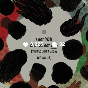
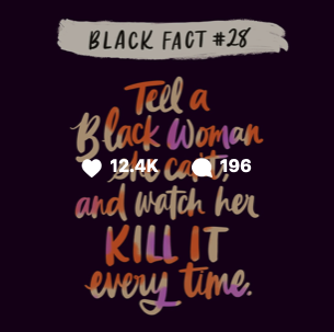
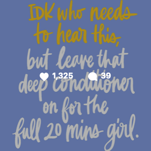
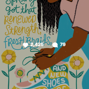
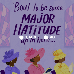
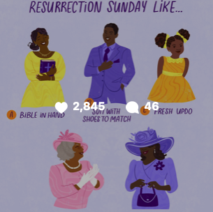
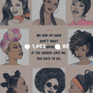
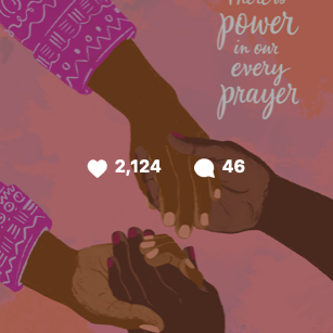
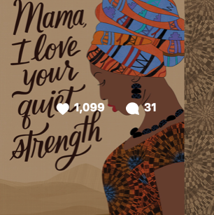
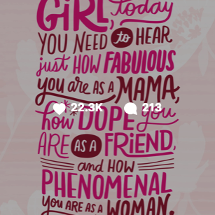
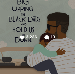
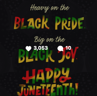
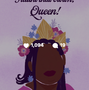
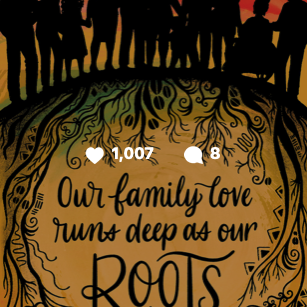
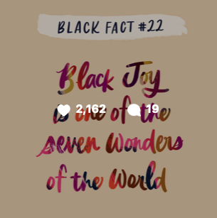
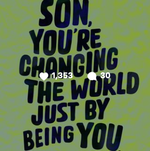
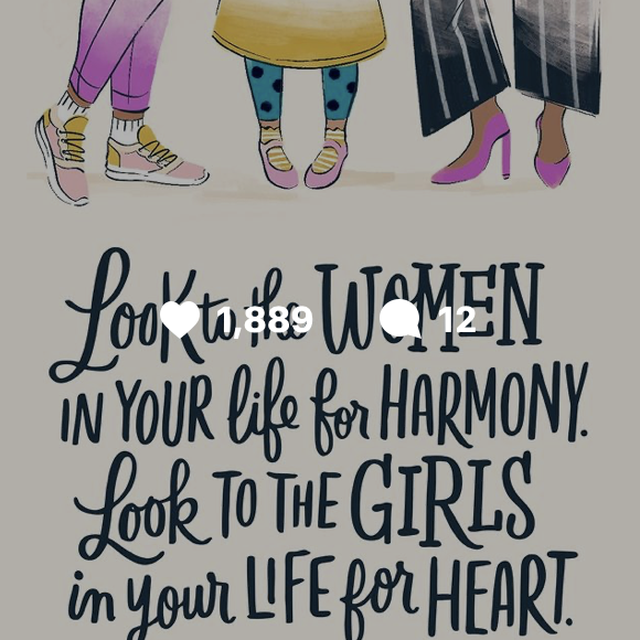
Scaling a Cultural Brand: Building a Content Ecosystem for Hallmark’s Mahogany Brand
Context
Mahogany is Hallmark’s culturally focused brand celebrating Black identity and community. The brand needed to expand digital visibility while maintaining a cohesive voice across social media, campaigns and the launch of Mahogany.com.
Strategic Problem
Audience engagement was growing, but the brand needed a stronger content and visual system to sustain growth across platforms. Without a structured ecosystem, campaigns risked becoming fragmented and inconsistent.
Strategic Intervention
I contributed to developing a scalable content and visual framework that aligned brand storytelling with audience behavior and platform trends.
My role included:
Creative direction for lifestyle and product photo shoots
Development of social content systems
Brand-aligned campaign assets across digital channels
Cross-functional collaboration with marketing and content teams
System Built
The work focused on creating a repeatable content ecosystem that allowed the Mahogany team to scale storytelling while maintaining brand consistency.
Key components included:
modular content series for social media
cohesive visual storytelling across campaigns
photo and video assets designed for multi-platform distribution
Outcome
The system strengthened audience engagement and brand visibility.
Results included:
20M+ impressions
191K+ engagements
50% growth in Instagram followers within one year

From Identity to Infrastructure: Building the Lively Paradox Brand System
Designing a scalable brand system for a growing coaching brand
Role
Brand Systems Designer & Creative Strategist
Focus Areas
Brand Systems Architecture
Positioning & Visual Identity
Marketing Infrastructure
Experience Consistency
Deliverables
Brand Identity
Visual System
Marketing Templates
Brand Guidelines
Context
Lively Paradox is a personal development and coaching brand centered on growth, self-discovery and intentional living. As the business expanded its offerings across digital platforms, content and client experiences, the brand needed a cohesive visual and messaging system that could support that growth while maintaining a distinctive voice.
The challenge was not simply creating a logo or aesthetic. It was building a brand system capable of supporting a growing ecosystem of touchpoints.
Audience & Positioning Insight
Lively Paradox operates in the personal growth and coaching space — a category often saturated with visual clichés and interchangeable messaging.
The brand needed to communicate something more nuanced: a balance between introspection and empowerment.
The strategic opportunity was to position the brand as both:
thoughtful and reflective
confident and forward-moving
This positioning informed the visual system, ensuring the brand communicated both clarity and depth across its touchpoints.
Strategic Problem
As the brand evolved, its visual presence and marketing materials were being created in isolated moments rather than through a unified framework.
Without a structured brand system:
visual expression risked becoming inconsistent
marketing assets required constant reinvention
new offerings could dilute the core brand identity
The brand needed a scalable identity system that would maintain clarity and cohesion across digital, print, and client-facing experiences.
Strategic Intervention
My role was to translate the brand’s philosophy and voice into a structured visual ecosystem that could scale alongside the business.
This included:
clarifying the brand’s visual narrative and positioning
developing a cohesive identity system
designing foundational marketing and communication assets
establishing guidelines for consistent application across platforms
The focus was not just aesthetic alignment, but building a system the brand could operate from moving forward.
System Built
The final brand system created a flexible yet structured framework for Lively Paradox to grow within.
Key components included:
brand identity and logo system
typography and color architecture
visual storytelling direction
digital and print marketing templates
foundational brand guidelines for future expansion
Together, these elements created a repeatable design language that allowed the brand to maintain consistency while adapting across evolving content and services.
Outcome
The result was a cohesive brand foundation that strengthened how the organization communicated across its platforms and experiences.
With a unified visual system in place, the brand gained:
stronger recognition and clarity in its messaging
a scalable toolkit for marketing and content creation
consistency across digital and client-facing touchpoints
Rather than redesigning assets repeatedly, the organization could now operate from a structured brand system designed to support long-term growth.
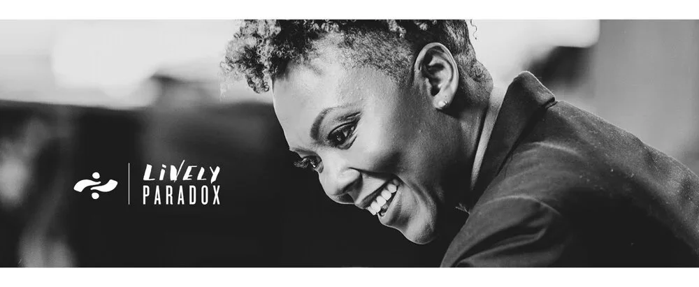
www.livelyparadox.com | Lively Paradox Virtual Training
Lively Paradox exists to help everyone find their passion, purpose and ideal position of influence. With decades of leadership, executive coaching, speaking, and most importantly, real-life, in-the-trenches business experience, Nicole’s view is drastically different. She understands that if leadership is anything at all, it is personal. She fundamentally believes that anyone who wants to be a leader can be one and be darn good at it.
Brand Identity, Business Card Design, Web Design, Virtual Training Creation, Social Media Strategy, Social Media Design, Web Management, Art Direction, Creative Direction, Brand Management, Content Creation, Social Media Management, Creative Direction, Project Management, Storyboarding, Template Design, Collaborative Video Production, Digital Workbook & Worksheet Design