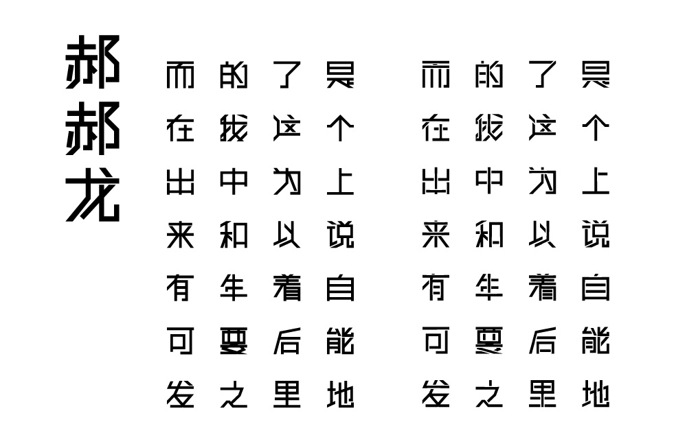
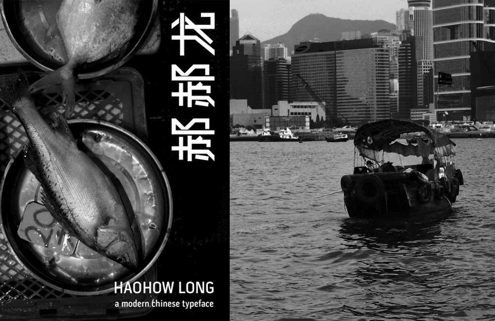
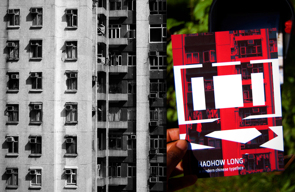
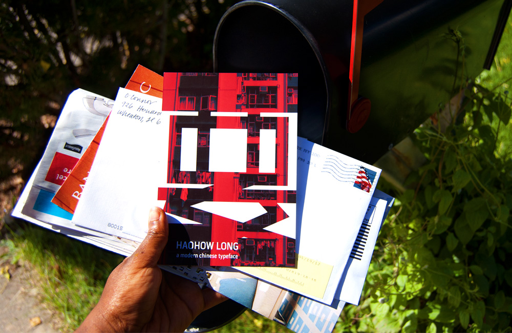
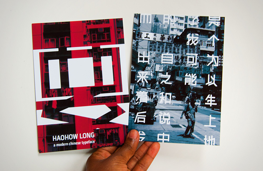
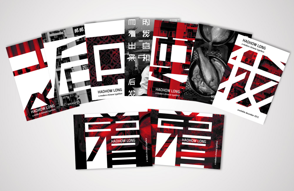
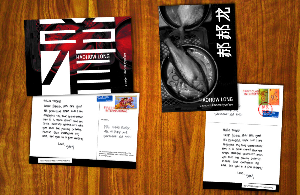
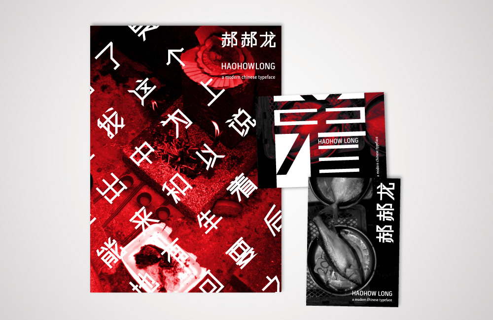
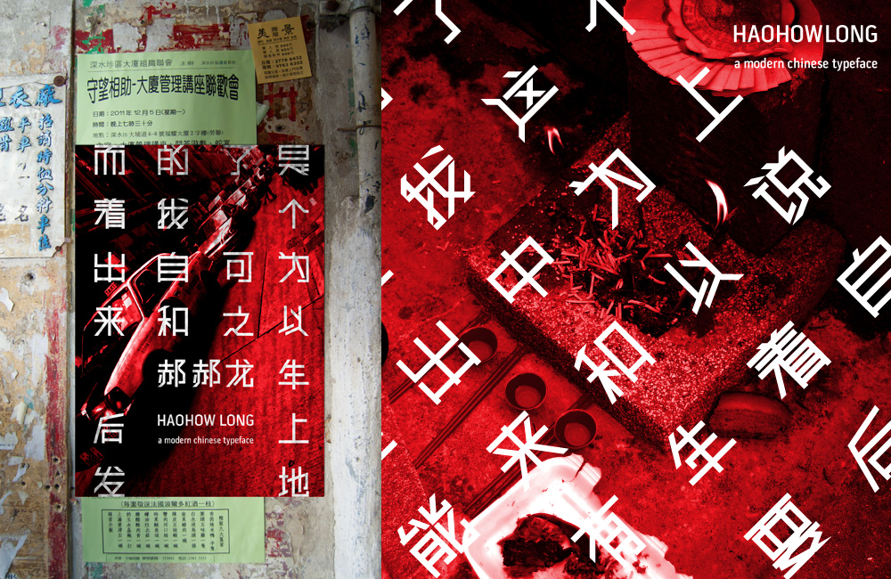
HaoHow Long
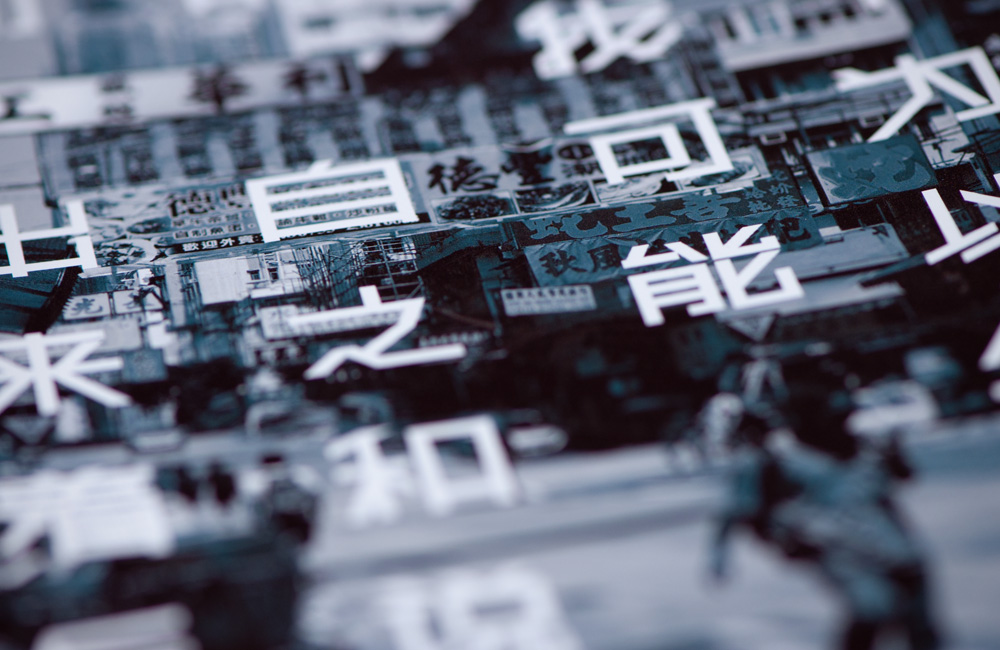
During my time in college I was so fortunate to have the opportunity to study abroad in Hong Kong for 6 months. Amongst learning to understand cultural differences, food palettes and exploring the vast city, I was inspired to create a typeface to showcase the simplified forms of the chinese characters. To start, I researched the most commonly used characters in the chinese language, and then refined the forms into basic shapes and symbols that still communicated the simplified chinese characters. The goal in design was to create an initial set of geometric, mono weighted forms that can be used to continue improving the use of typography in the global market place.
The forms were designed on a 9-modular grid which reflects the imperial number of traditional chinese emperors. The culture of China is a blended mix of contrast: tradition and modernity, the old and the new generations, and a constantly moving yet stagnant city. HaoHow Long is a typeface that speaks to the contemporary culture of China and presents a beginning collection of standard geometric, san serif forms that can integrated into it’s ever developing society.
Type design
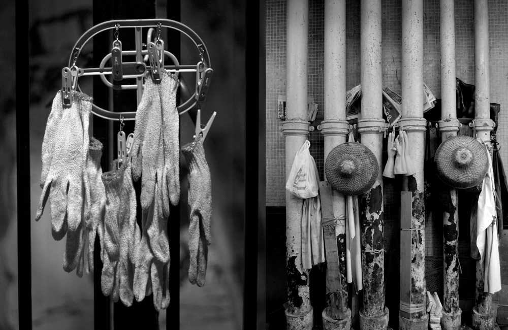
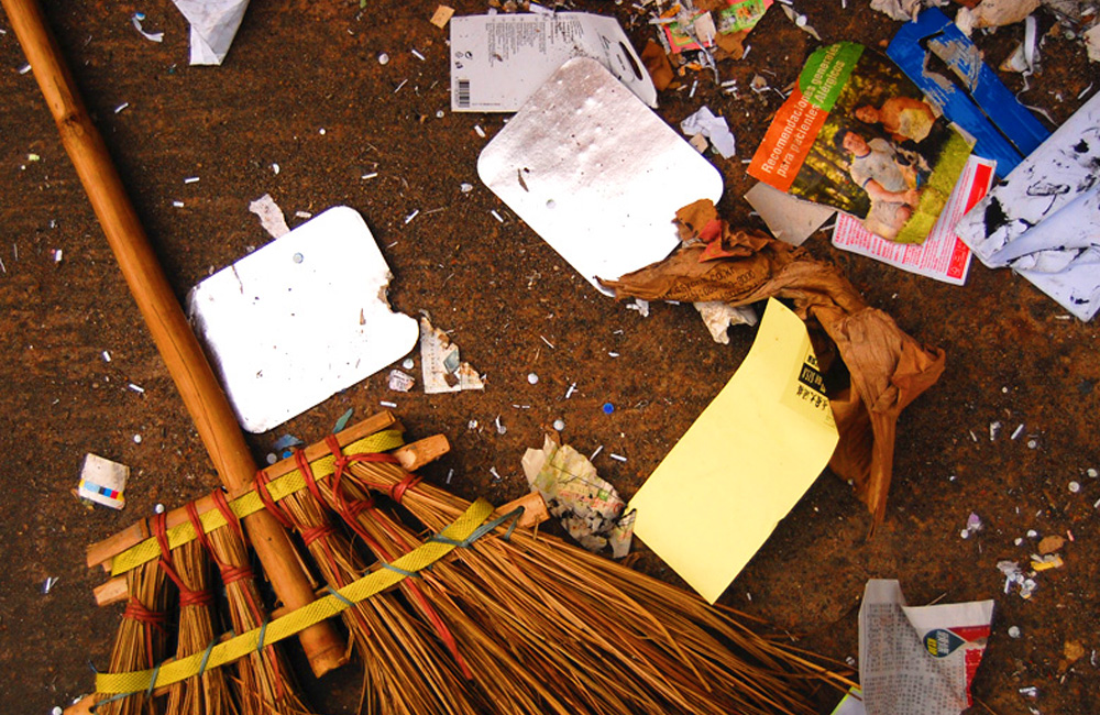
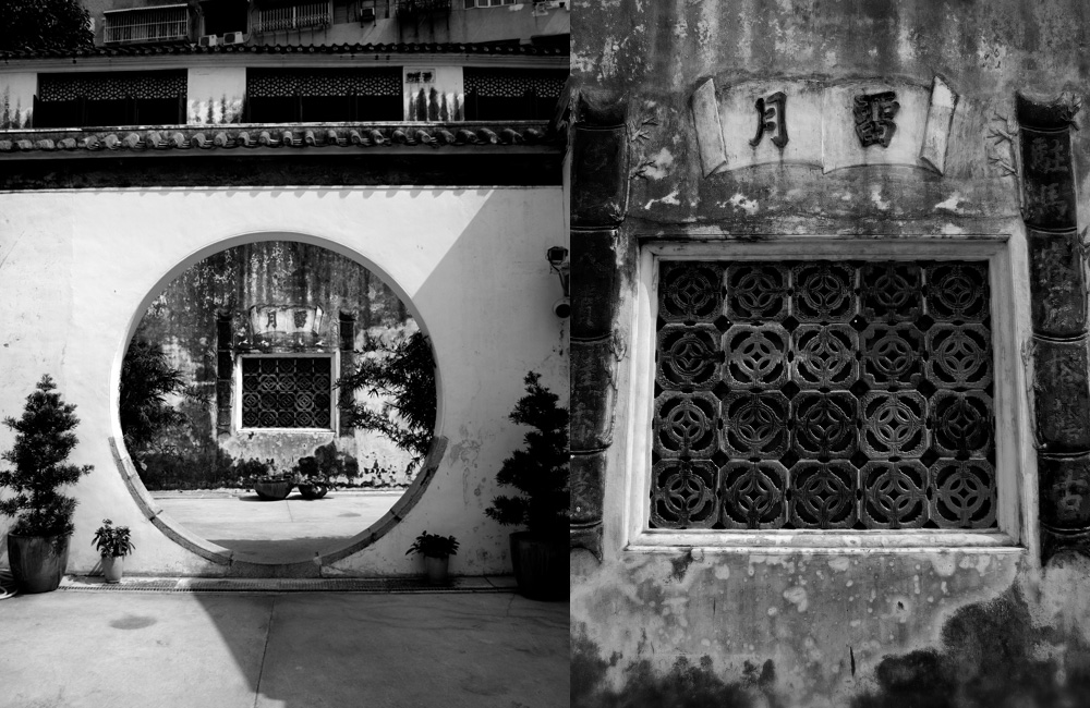
Photography